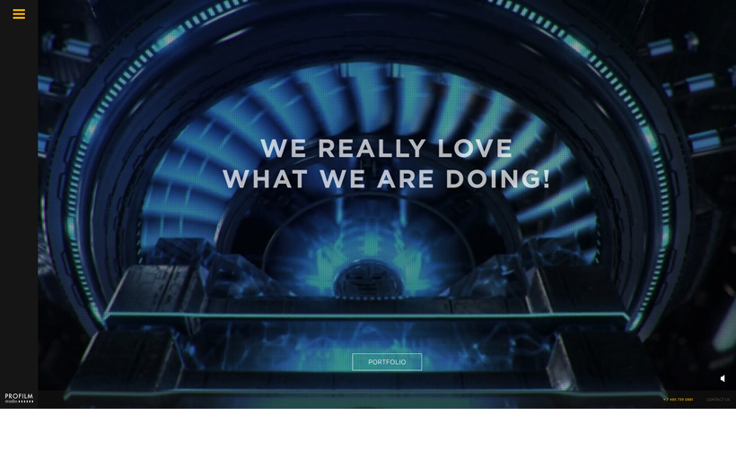
Profilm
- Websites / advertising / animation / demoreel / film / fullscreen / html5 / Portfolio / production / sidemenu / video
- Source
What We
At first glance I didn't appreciate the "flatness" of the profilm site, then I looked closer and browsed around and fell in love. I like the very simple "off canvas" type navigation and content containers that push in from the left hand side as you browse. Try for yourself, you'll like the simple flow.
Site portfolio for Profilm production house.
Leave a Reply
 5
5