Thomas Flad
- Inspiration / Websites / big background image / blue / fixed navigation / one page website / Portfolio / scroll / white
What We
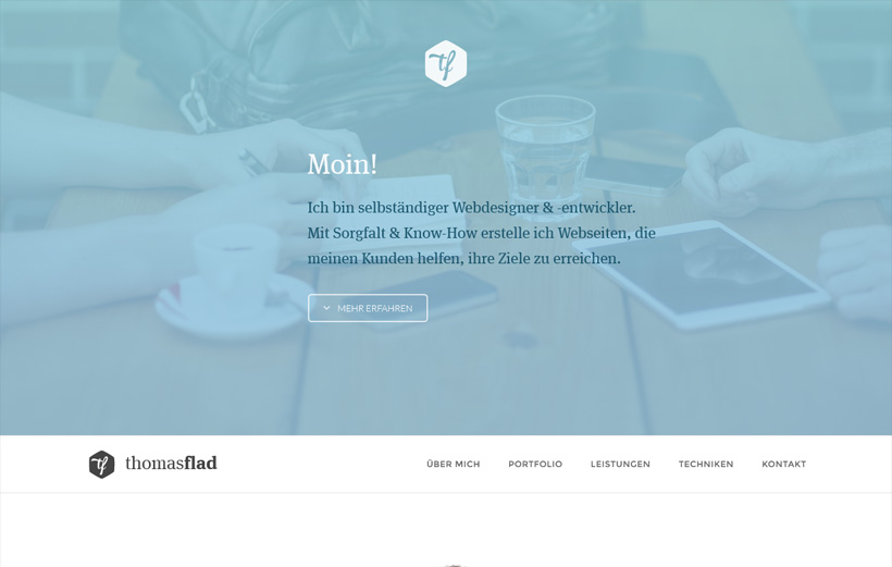
I love the shade of blue chosen for the accent colors on Thomas Flad. The transparency works well with the large image that's noticeable just enough. The fixed navigation gets started once you scroll down and has a clean, crisp appearance.
Leave a Reply
 0
0