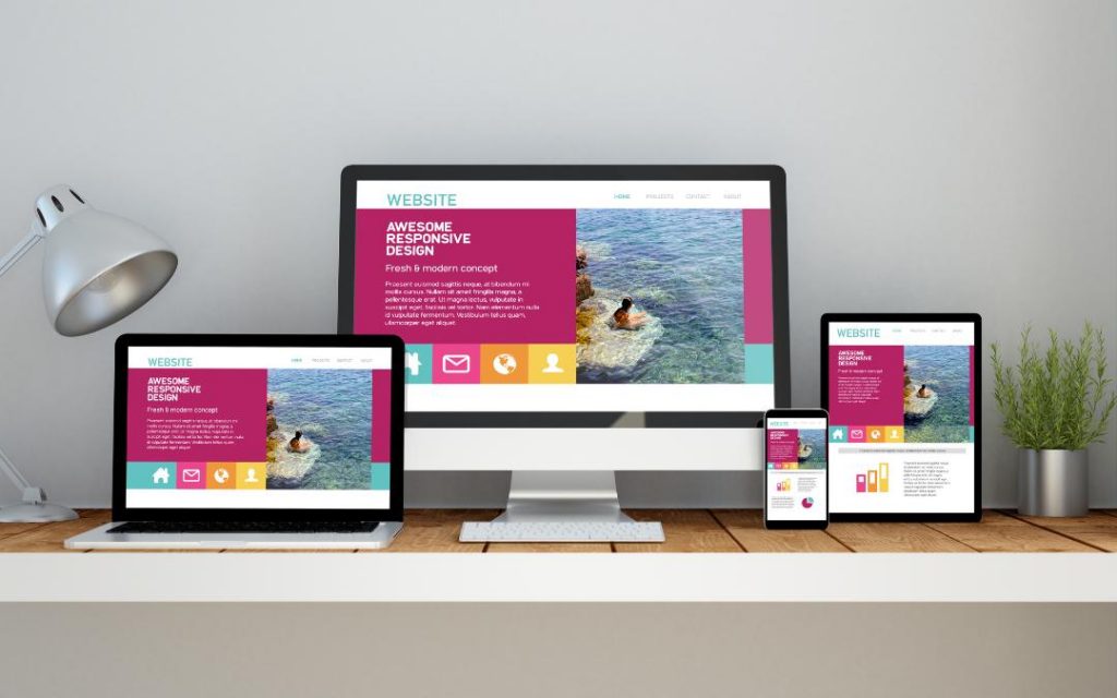
If you’re wondering what makes a good website then check out this blog for web design trends that’ll improve your site.
Your website is your digital curb appeal. It’s the first impression people have of you and your company.
You need to ask yourself what kind of message you want to convey to visitors of your website. Most people in marketing and business realize the need to have a good website.
But what about the question what makes a good website?
The website design trends are constantly changing a year from year. It’s important to keep up with the latest developments in web design. This can be the difference between success and failure when it comes to your website.
Keep reading to find out more about what makes a website good.
1. A Responsive Web Design
Responsive Web Design (RWD) is an approach to designing a website that ensures that web pages function on a variety of devices.
This has become particularly important since Google introduced the ‘Mobilegeddon’ update in 2015.
If websites don’t include a user-friendly experience on different devices from smartphones to tablets to laptops, they’ll be penalized.
If you want to design a great website, it’s essential you make sure your website functions across devices and screen sizes. Find out more info about responsive web design.
2. Minimalist Design
You’ve probably noticed that there’s an increasing ‘back to basics’ approach to web design. The minimalist webpage layout is becoming a must for any great website.
Users don’t want to be bombarded with endless web pages and buttons. Simple designs with plenty of blank space around the borders of the web page are definitely the way to go.
Many web designs are adopting ‘flat design‘. This involves a simple style with flat colors. It typically includes creating the illusion of three dimensions with the inventive use of shadows and gradients.
3. User-Friendliness
If you want people to use your website, make sure it’s friendly to them.
This means it needs to be easy-to-navigate around the website. Digital design, as with any design, should be intuitive. Nobody should have to read the instruction manual to discover how it works.
By creating a website that is easy on the eye, people are much more likely to want to stick around for a while.
It’s also good to make sure your website is speedy to switch between pages. People don’t stay for long if they have to wait for your web pages to load.
4. Personalized Experience
The days of marketing to the same message to the same group of people is over. Nowadays, personalized marketing experiences are growing. Users are starting to expect this too.
This means that you have to create user-specific content and experiences to draw in particular kinds of visitors.
According to research, over 70 percent of users become frustrated by regularly receiving content that they’re not interested or engaged in at all.
5. Produce Great Content
Content marketing and creation is a hugely expanding area of digital marketing.
You can no longer fill your website with SEO-optimized content that makes no sense. Nowadays, it’s important to produce high-quality content that people actually want.
There are many different ways to produce content. This ranges from video, images, blog posts and infographics.
You can’t be complacent and just assume that your traffic will continue to grow. Instead, you need to be constantly producing even greater content to keep your visitors hooked.
6. Use of Color
The use of bright and vibrant colors for web design was previously considered quite cheesy and tacky. With a greater understanding of color psychology, an increasing number of the top websites are choosing to go bright and bold.
It’s important to think about which type of user you want to attract to your website. This should inform which colors you go for.
According to research, the first impression of your website is largely based on the colors used. You can’t afford to leave this to an afterthought.
7. Background Videos
Have you ever arrived on a website’s landing page to be greeted by a background video straight away?
This is a great way to immediately grab the attention of the user. With faster internet speeds, this doesn’t take anything away from the rest of your website’s content.
8. Card-Based Design
One of the growing web design trends is card-based design.
As a result of the increased use of smartphones and tablets to browse the internet, card-based designs are much more user-friendly. This is because unlike other types of designs, card-based designs can adapt to different screen sizes without any problems.
9. Full-Width Strips
Full-width strips, also known as wall-to-wall strips, are a great way of dividing your website’s layout. As the same suggests, it’s strips of boxes that stretch from one side to the other side of the screen.
Each section is separated into different rectangular boxes.
This allows for an easy-to-use functional design. Users can select the types of content they’re most interested in.
10. Innovative Navigation
We all know the conventional navigation menu. It’s often easy-to-use at the top of the layout of the website. It mostly includes an “about us” page, “contact us” section, and perhaps a “blog” or an “online store”.
Many websites are experimenting with innovative ways of helping users navigate through websites. They often use so-called “ghost buttons” that blend in with the website and allow for a cleaner finish.
What Makes a Good Website?
Now you know what makes a good website and you know the biggest web design trends emerging in the field.
It’s not easy staying relevant in the ever-changing world of web design, but it’s good to keep up to date. If you want to have a successful website, make sure you’re doing at least some of the above.
If you enjoyed this blog post and you want to read more blog posts like this, check out our article, “5 Ways to Improve User Flow and Experience for Your Website”.